Throughout the final semester of my 10-month-long, intensive Master of Arts in Interactive Media program, I was developing my thesis project. It is the capstone of our academic year, allowing each graduate to produce something that combines everything they’ve learned while in the program. When I started brainstorming for ideas in October 2019, I was not sure what I was going to do. I knew three things for a fact, though – I love science, I love education, and I love every single thing that we had learned in the program thus far. Those three things are pretty broad and leave a lot of room for possibilities and thoughts. Finally, by discussing with some of my professors, I narrowed it down to two ideas, one about native North Carolina wildlife, and the other about the basics of climate change. I listed out the pros and cons of each possible product but ultimately decided on the basics of climate change idea, as that was something that I felt was more doable and likely to be completely finished in the semester time period we had.
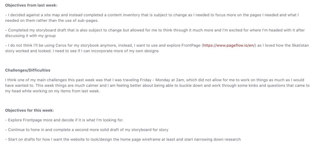
The planning for my project began with research of my topic and goal-writing every week, facilitated by our instructor, Dr. Xu. Each week I would write three goals I wanted to complete for my project, and then reflect back on the previous weeks goals and whether or not I had accomplished them. If I hadn’t accomplished them, I broke down the reasons why I hadn’t and wrote down how I could improve and make sure I finished the next goals. Below, you can find an example of what these goals and reflections looked like.
PROJECT INFO.
CLIENT: Elon's M.A. in Interactive Media Program
DATE RELEASED: May 20th, 2020
MY ROLE(S): Graphic Design, Web Development, Storytelling, Project Management TOOLS USED: Adobe Illustrator, Ceros, Brackets, HTML5, CSS3, JavaScript, Google Scholar/Academic Search Complete,
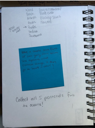
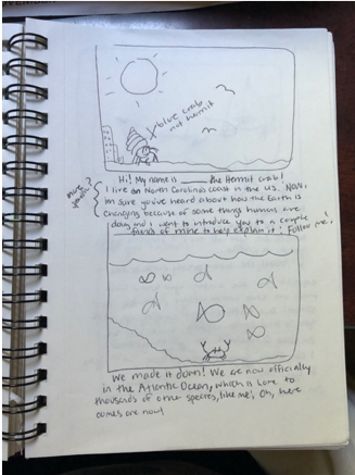
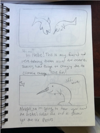
My next step in creating my project was creating the storybook aspect of it – in the goals above, you can see that I had looked in to a platform called Frontpage to host it, however, I decided that Ceros would be a better fit for what I wanted to do. I wanted my storybook to help kids understand what was happening with climate change in our ocean. To do this, I had a main character, Georgie, walk the reader through different stories in the different bodies of water. Below, you can see some of my original first draft storyboards created for this story.
Notes of which bodies of water I was doing, and possible ideas to implement storylines.
First draft storyboard. I originally thought a Hermit Crab would be my intro animal.
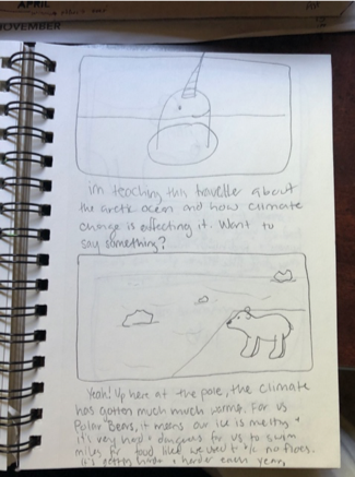
Narwhal’s make the best guides.
Nellie the Narwhal explaining climate change in a first storyboard.
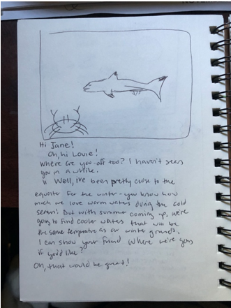
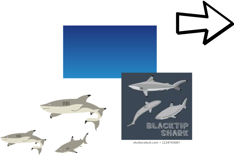
First look at a crab and a Black Tippled Reef Shark.
Following the drafts of my storybook I made final decisions on what animals would be my characters and how I would implement them. The next step was one of the most challenging for me – designing them. Graphic design is something that does not come as easily to me as relaying information; it is something I have to focus on, do a lot of research, and reach out to my network for help with, which is exactly what I did. I ended up creating five different characters and five different backgrounds to match the bodies of water I was portraying, and put together five different story lines and a closing storyline to complete the story in Ceros. The final product of this storybook can be viewed by clicking the link here ( http://view.ceros.com/elon-university-imm/georgies-journey ) or by going to the website linked above on the right.
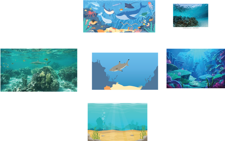
The Pacific/Great Barrier Reef mood board.
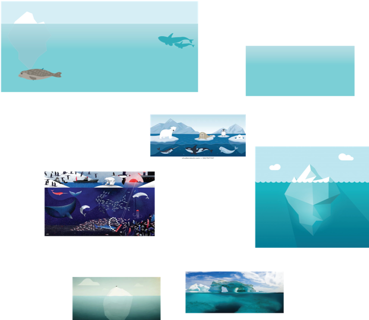
The Arctic mood board.
Views of Ellie the Blacktip Reef Shark.
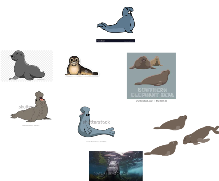
What my inspiration board for Alex the Elephant Seal looked like. The designs of Alex resulted in the bottom right three images.
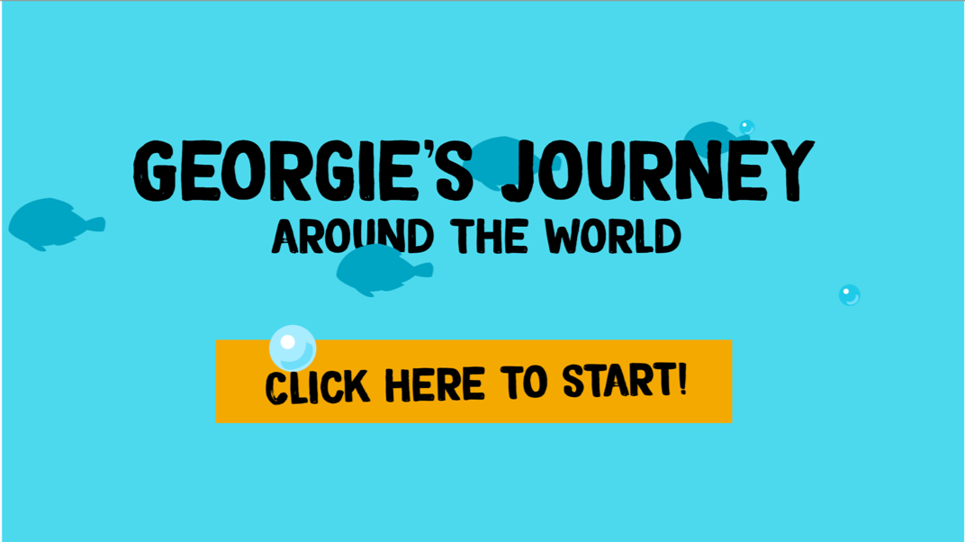
Title page of the story.
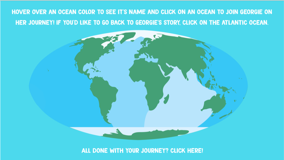
How to navigate to the different oceans on web.
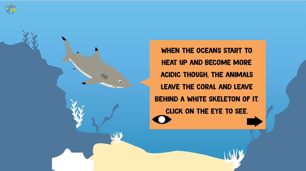
Ellie the Reef Shark/Pacific.
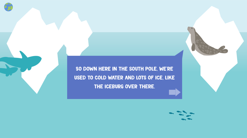
Luna the Ringed Seal/Arctic.
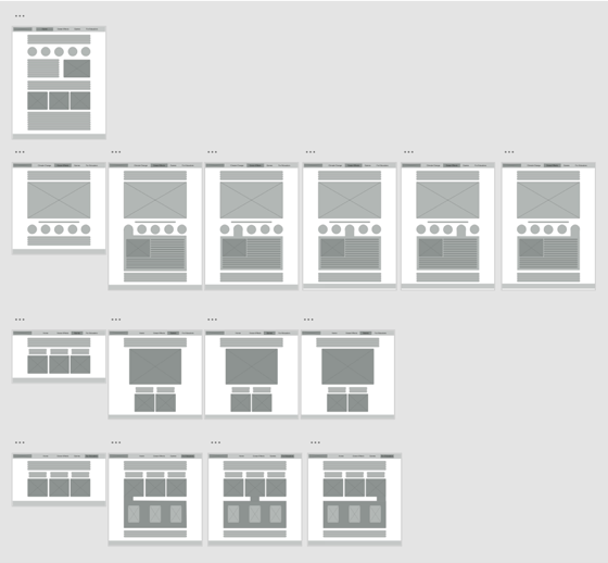
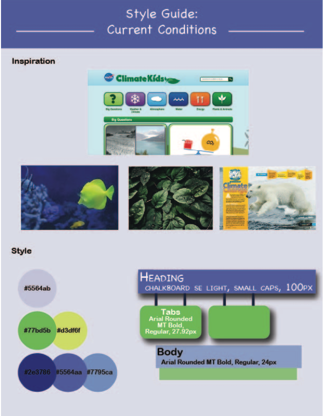
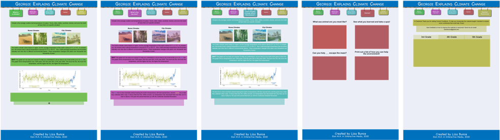
Following the completion of my storybook, I could now start shaping up my website’s content and storyline. I decided to create my website using HTML, CSS, and Bootstrap, allowing for a more accessible, and easily responsive website. I wanted to make sure it could be viewed on web, tablet, and mobile, although its primary design was for web or tablet. To start this process, I created wireframes of what I thought my website could look like. Following the wireframes, I created a style guide with colors and typefaces I thought would be using. One thing I realized as I started to implement these colors to mockups was that I had designed for an older audience, and not my 3rd-5th grade audience like I had wanted to. This made me go back and figure out how to make the site more kid friendly, resulting in my second round of mockups.
Wireframes in Adobe XD.
Original style guide based on first mockups.
First mockups.
Second mockups.
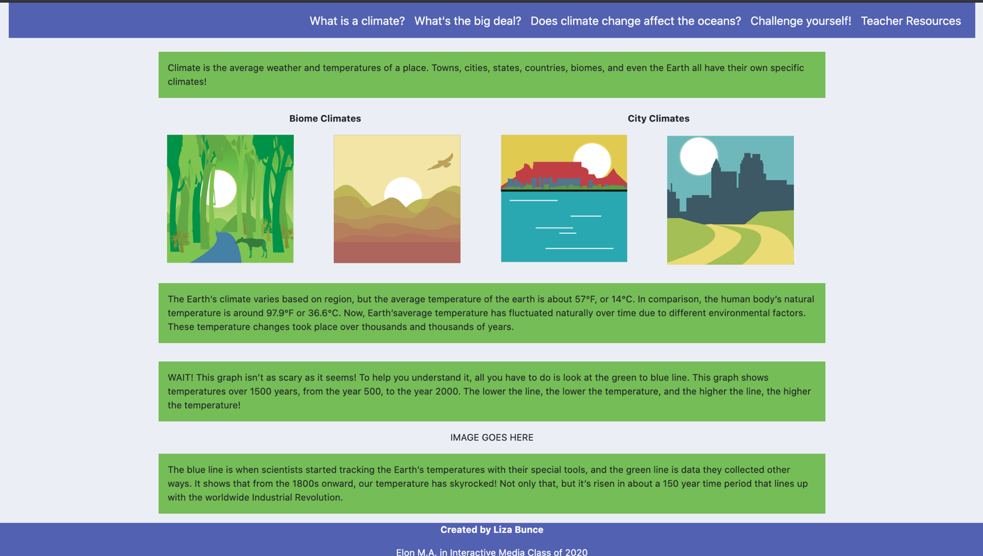
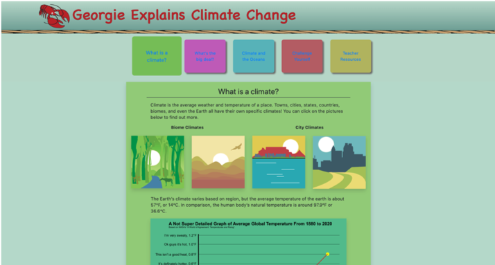
Around the time of the second mockup, it was time for our spring break, the only difference from a regular spring break this had was that we knew that we would be home for at least three weeks, as COVID-19 had just hit in NC and things were beginning to close and get serious. I had figured that as COVID-19 was continuously getting worse in NC, we would most likely be home the rest of the semester, so that was what I planned for in my time management and scheduling of goals. I made sure I planned ahead for meeting with professors or with my classes and set up hours each day that would be dedicated to my project and other classes. My biggest worry being at home was that I didn’t know how user testing would be, as that was in my original schedule I had made for myself. As COVID-19 further developed, public schools went online, which meant that the teachers I had originally planned to meet with to create my supplemental instruction worksheets were thrust very suddenly into transferring all of their material online. I had two people cancel, and out of respect for their situation, I reached out to the one other teacher I had talked with and let her know not to worry about me, and to just focus on her students and moving online. This ended up not being a horrible thing, as I still had my family I was living with – my parents, brother, and sister – as well as my classmates and professors, that were able to give me feedback about the different aspects of my website as I went along and sent it to them. The final product of my website underwent a couple more changes than my second mockups, including a complete color palette makeover, and a different navbar than originally planned so that things were easier for children to click. Below are some screenshots of the home page evolution of my final product. The completed version of the project can be viewed by clicking the link at the top.
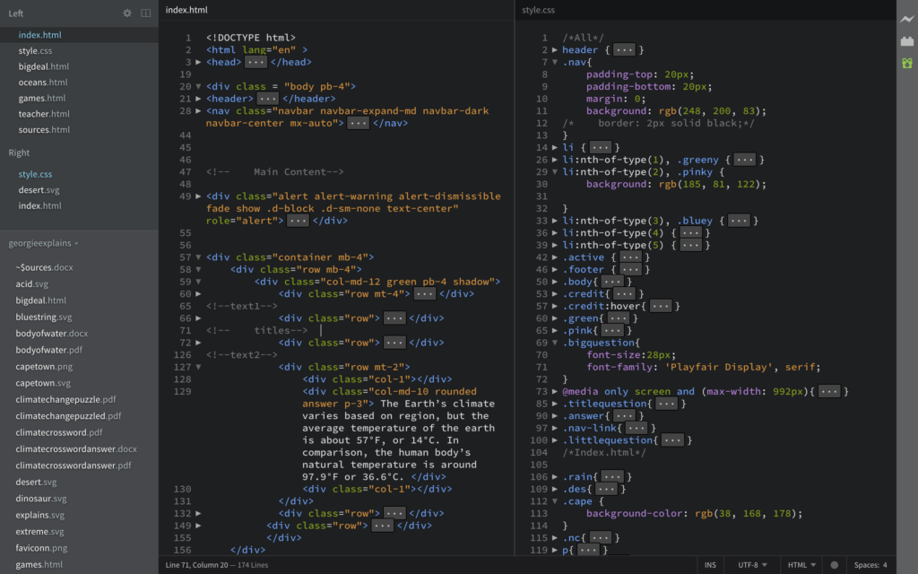
Some snapshots of my HTML and CSS.
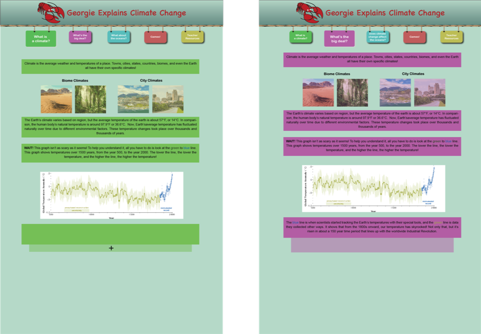
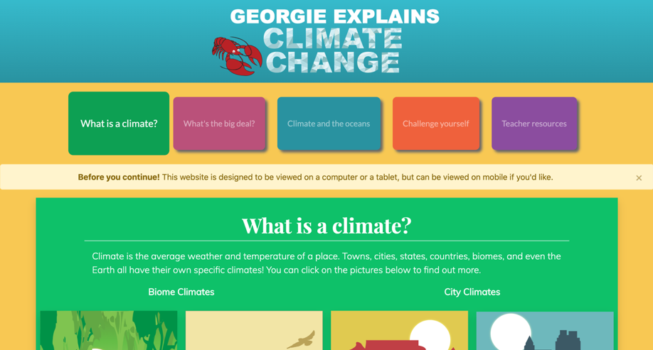
The first version of the home screen of “Georgie Explains Climate Change”.
The second version of the home screen of “Georgie Explains Climate Change”.
The final version of the home screen of “Georgie Explains Climate Change”.